
Income Inequality In Ireland
23 Aug 2013Introduction
There are various different methods used to measure income inequality and income distribution. This report looks at four measures commonly used to examine income inequality; the Gini Coefficient, Interdecile ratios, Income Quintile Share Ratios and the at-risk-of-poverty indicator.
The Gini Coefficient
The Gini Coefficient measures the degree of inequality in the distribution of family income in a country. The Gini Coefficient is valued at between 0 and 1; with 0 being perfect equality and 1 being perfect inequality. If measured as a percentage, 100% implies complete inequality with one person holding all of the income in a country.
Gini Coefficients can be calculated on a market income basis (pre-tax) and also on a disposable income basis (after taxes and transfers). When completing cross country comparisons, Gini Coefficients calculated on disposable income will generally present much narrower differences. Effective welfare and tax systems significantly lower income inequality.
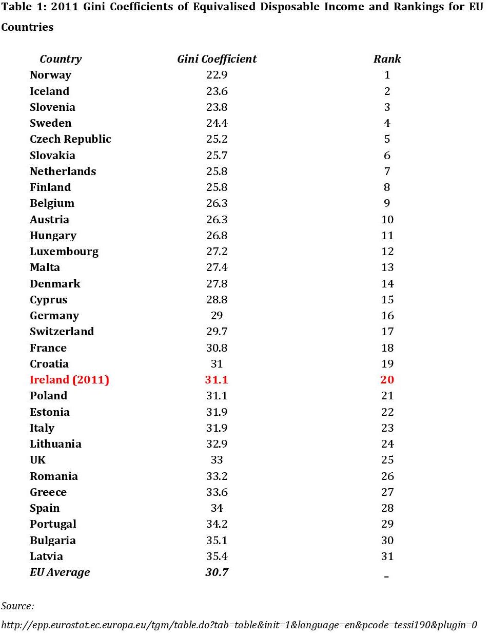
Ireland had achieved a gradual reduction in its Gini Coefficient from the 1990’s up until the end of 2009. In 2009 Ireland had a Gini Coefficient of 28.8, and was ranked 14 out 31 EU countries coming in below the EU average which at the time was 29.26. However in 2010 Ireland’s Gini figure rose dramatically to 31.6 which consequently placed Ireland 23rd in the rankings. The sharp rise in income inequality from 2009-2010 reversed all the progress that had been made and resulted in us being classed as the eighth most unequal EU country in terms of income distribution in 2010, coming in above the EU average which was 29.2.
In 2011 however Ireland moved up the rankings to twentieth place due to our Gini Coefficient falling to 31.11 . It is worth noting that during this same period from 2010 to 2011, the EU average Gini Coefficient increased as Ireland’s decreased.
The 2011 Gini Coefficients along with the rankings of each of the European Union countries are listed in Table 1 below.
Notes:
• Rank 1 implies the most equal country, Rank 31 the most unequal.
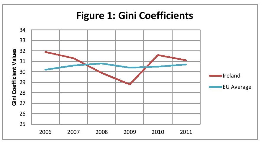
Figure 1 shows that Irelands’ Gini Coefficient fell below the EU average in 2007 and continued to fall until 2009. In 2010 it increased above the EU average. Although it remained above the EU average in 2011, it was only slightly above and it remained below that of the UK.
While the Gini Coefficient is the most commonly used measure of income inequality, it suffers from some drawbacks. One such drawback is that the Gini Coefficient is silent on where in the income distribution inequality is taking place. To illustrate this point, consider the income distributions of two hypothetical counties. In the first country, there is a large disparity between those at the bottom of the income distribution and those in the middle, but less so between those in the middle and those at the top of the income distribution. In the second country, the situation is reversed so that there is a large disparity between those at the top and those in the middle, but a lesser disparity between the middle and the bottom. Conceivably, the Gini Coefficient for both countries could be the same, but this masks significant differences between the income distributions of these two countries. It is as a result of these short comings that other measures of income inequality may be more suitable in certain circumstances depending on what information is required.
Interdecile Ratios
Interdecile ratios are another method available to measure income inequality. Interdecile ratios compare the disposable income between different income groups. There are three Interdecile ratios used; the first compares income in the highest income decile to that in the lowest and it is called the P90/P10 ratio. The ratio of those in the highest decile to those in the median income decile is the P90/P50 ratio. The final Interdecile ratio used is the P50/P10 which gives the ratio of the median deciles’ disposable income against those in the lowest decile.
The most current Interdecile figures available at present are from 2009. These figures revealed Ireland had a P90/P10 ratio of 3.702 which implies the highest earners had disposable income 3.702 times more than those in the lowest income decile. The P90/P50 ratio for Ireland in the late 2000’s was 1.882 meaning the individuals in the highest income decile had 1.882 times the disposable income of their counterparts in the median decile. Both of the above ratios were below the OECD average; however the P50/P10 ratio of 2.182 was above the OECD average of 2.114.
Income Quintile Share Ratio
The income quintile share ratio is a ratio of the average equivalised income received by the 20% of persons with the highest income (top quintile) compared to the average equivalised income received by the 20% of persons with the lowest income (bottom quintile). It is known as the S80/S20 ratio, the higher the ratio value the greater the inequality.4 The 2010 figure for Ireland of 4.9 remained unchanged in 2011.
The average quintile share ratio of the 27 EU countries in 2010 and 2011 was 5.0 and 5.1 respectively. Ireland was below the average in both years.
The at-risk-of-poverty Indicator
One way of measuring the impact of a welfare system on reducing income inequality is to examine the at-risk-of-poverty indicator before social transfers, and after. Individuals whose income falls below a particular threshold (for the EU it has been set at 60% of the median income) are considered to be at risk of poverty. In 2011 Ireland’s at-risk-of poverty rate rose to 16% compared to 14.7% in 2010, however it was below the EU average of 16.9%. According to this data, the at-risk-of-poverty rate increased in 2011 despite the fact that the poverty line actually fell by 10% that year. Had it not been for social transfers, the at-risk-of-poverty rate would have been 50.7%.
Those living in rural areas, single parents, individuals with low levels of education, children, and the unemployed have consistently had a high risk of poverty. In 2011 however, the groups which showed a significant increase in their at risk of poverty rate included:
- Males aged 18-64.
- Students.
- Individuals whose highest level of education was upper secondary.
- Households where no one was at work.
- Those living in urban areas.
- Individuals living in accommodation paying below market rent, or rent free.
The at-risk-of-poverty indicator is especially useful as it allows us to identify particular groups of individuals that may be more at risk than others. One group which is of particular importance is children. In 2011, the at-risk-of-poverty rate for children was 18.6%.
Notes:
1 This was not a statistically significant change on the 2010 value.
About author
79 Merrion Square, Dublin 2, Ireland
tel: 353 (1) 676 0414 | email: info@publicpolicy.ie
Company registration number: 504956
Privacy Policy | Chairman's Blog | Events | Video | Public Policy Documents | News Property Tax Ireland | Pension Reform Ireland | Water Charges Ireland